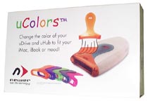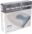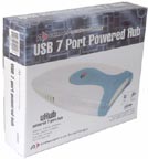
The packaging shown on this page reflect the first migration towards a new look and feel to coincide with a whole new product line. Newer was breaking new ground in the USB product category and wanted a separate and distinctive box to match.
A bold design featuring large product photos and large descriptive headings were chosen. A hint of past packaging was retained by using a sampling of the old background illustration to accentuate the bold headings.
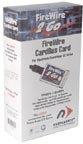
When a FireWire product was added to the product family, the new packaging theme was used to maintain consistency and brand awareness. This product was the first to receive its own logo.